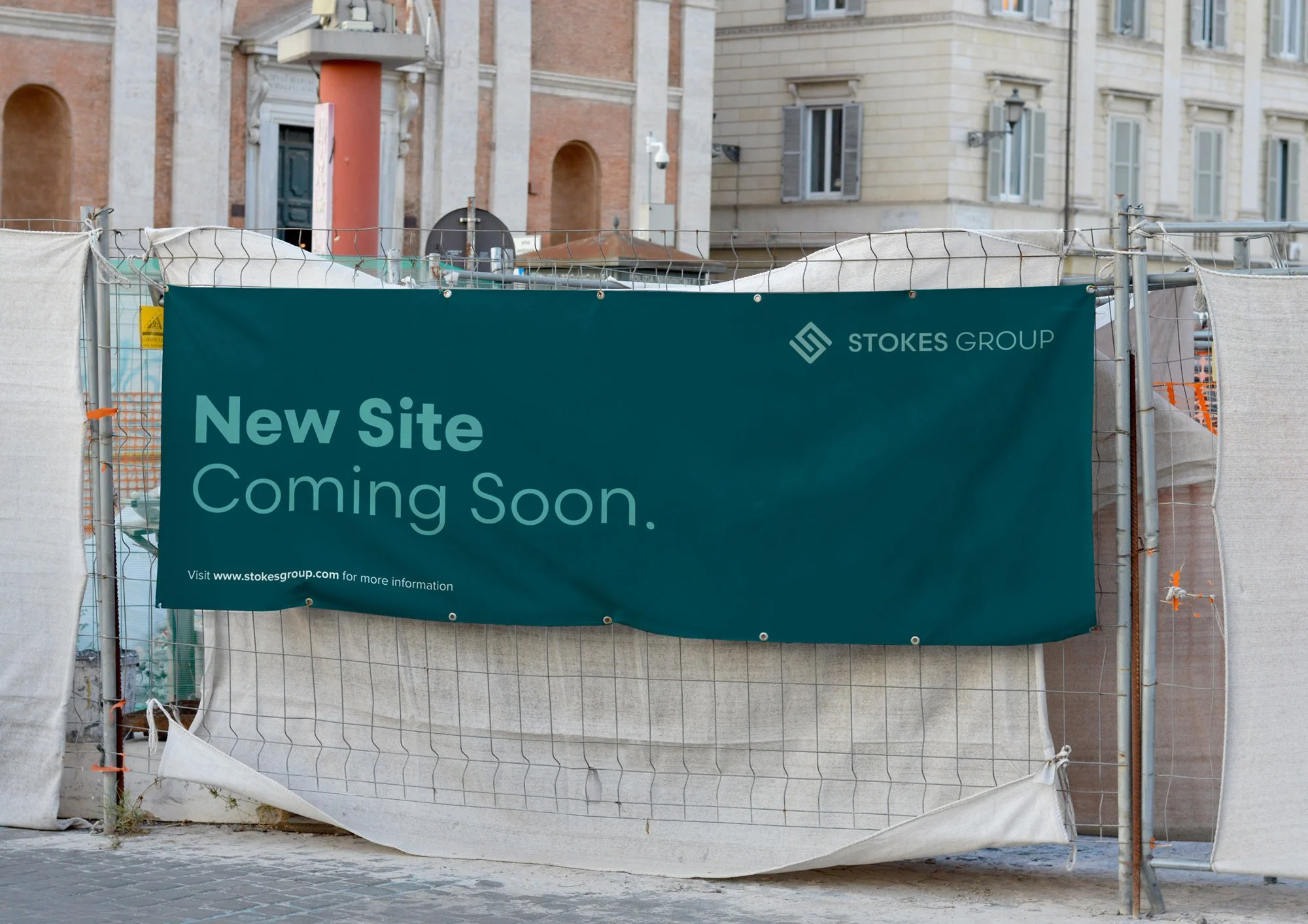
Stokes Group
2023
Brand Identity
Our main aim was to craft a bold and contemporary identity for Stokes Group, while keeping a minimal and sharp style.
The company offers a full range of services to satisfy its clients’ needs at every stage, continually improving as products evolve and new technologies emerge.
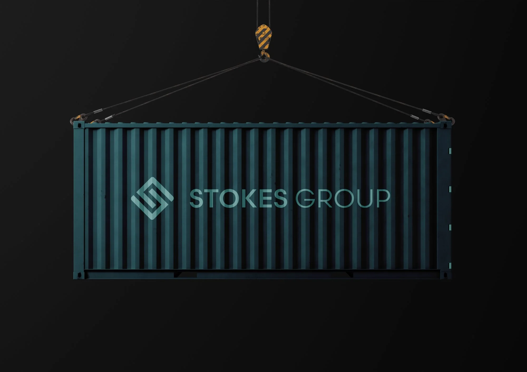
We created a symbol containing the letters “C” and “S” representing the Company Director, Chris Stokes.
The union of the two letters creates a striking, solid shape. This icon was designed with simple geometric elements, developed with a sober and timeless vision. The icon is complemented by a sans serif geometric-style typeface. We chose a colour palette with shades of grey, with a strong blue; that give a sense of trust and dependability to the visual identity.
The result is a progressive brand, oriented towards practical and functional design, with a conversation between a modern, minimalist and contemporary visual identity that brings the brand to life, allowing it to be implemented continuously and efficiently in different digital and offline environments.