
Scamps + Scholars
2022
Brand Identity
Scamps & Scholars Childcare Centre is a multi-service, not for profit centre, dedicated to providing safe, quality, fun care with education and developmental opportunities to the children and families of the community. The vision was to establish a distinctive brand identity which reflects Scamps & Scholars core values: Education, Purpose, Professionalism, Ambition & Fun.
The inspiration for this concept comes from Colour Psychology. Colour psychology is the study of how certain colours impact human behavior. Different colours have different meanings, connotations, and psychological effects that vary across different cultures. Colours and emotions are closely linked. Warm colours can evoke different emotions than cool colours and bright colours can create different feelings than muted colours.
This concept was developed through brand characters / mascots, a series of illustrated figures that represent each colour and how the particular colour has a positive effect on people. According to research from creative agency Moving Picture Company, mascots can increase profits and emotional connection to customers by up to 41%.
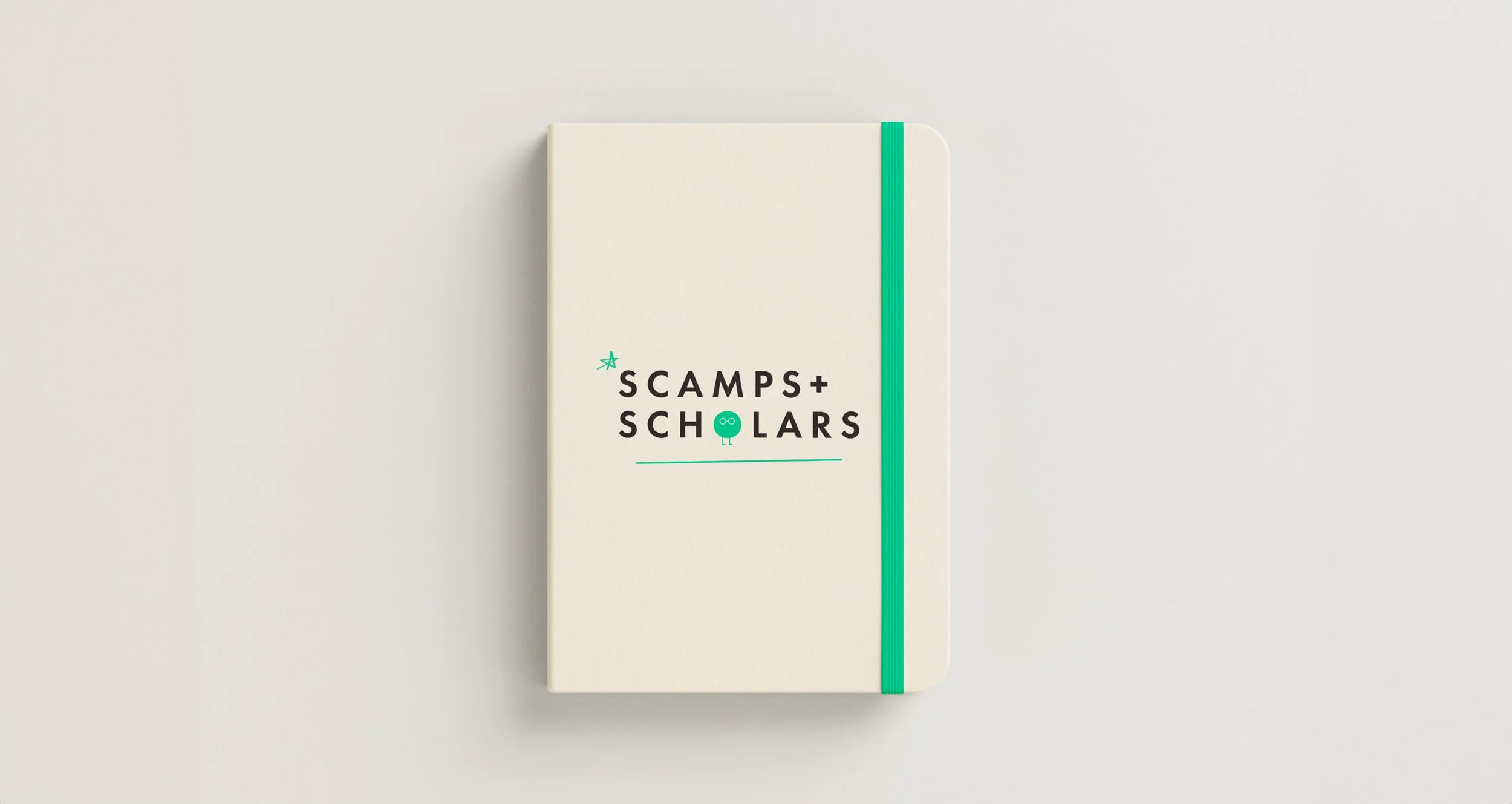
Doodle elements are implemented throughout the branding with lines, circles, stars and arrows. Doodles are simple drawings that can have concrete representational meaning or may just be composed of random and abstract lines. Every line and mark is unique, just like every child.
The tone of the brand is professional yet playful, with subtle details that convey meaning to both adults and children. Scamps & Scholars is a place of joy, ambition and trust where the children and parents are at the front of mind.
Design Language:
Professional – Progressive – Refined – Fun
– In collaboration with Anchor Studio


